Making 25 years of Swiss road accident data legible, and worth reading
Data Visualisation · Bern University of Applied Sciences · Academic project
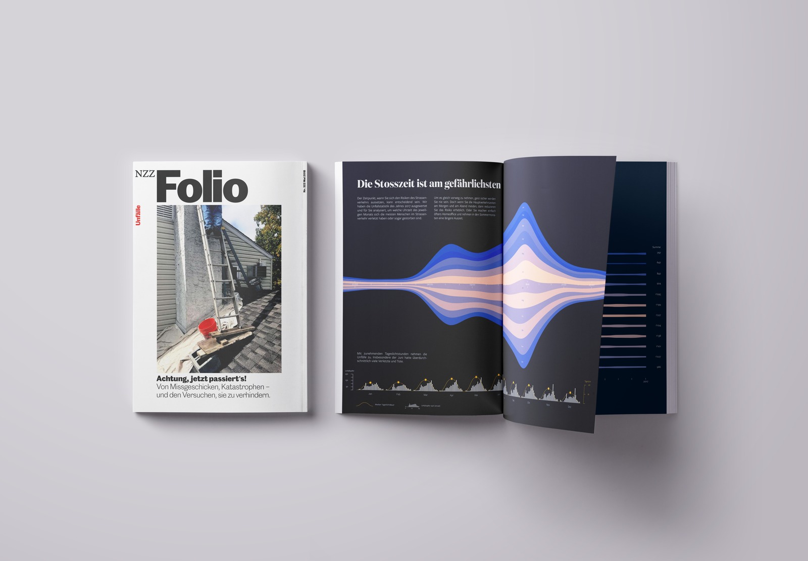
As part of my studies in data visualisation at Bern University of Applied Sciences, I was commissioned to take on a self-directed visualisation project. I chose 25 years of Swiss road traffic accident statistics: dense, multidimensional, and covering a subject serious enough that it deserved more than a headline number.
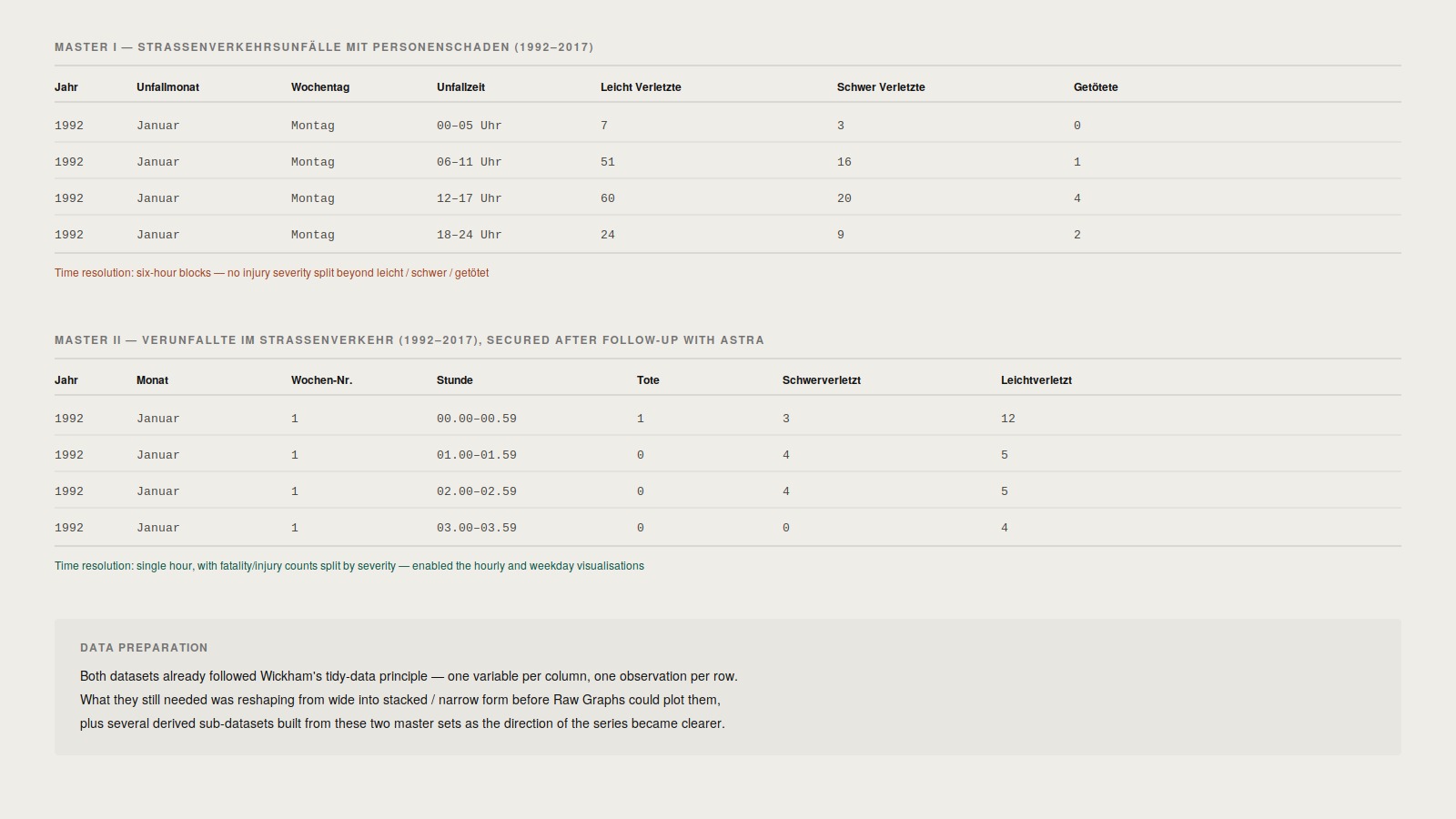
The initial dataset from the Federal Statistical Office, Master I, was too coarse to work with: accidents were only logged in six-hour blocks, without victim counts. After repeated follow-up requests to the federal roads office, I got access to Master II, an hourly dataset with counts by injury severity, which is what made the later hour-by-hour and weekday visualisations possible at all.
Both datasets already followed Wickham’s tidy-data principle, so no cleanup was needed. But they still had to be reshaped from wide into stacked/narrow form before the visualisation tool I settled on could use them, and I built several derived sub-datasets from the two master sets as the direction of the series became clearer.
The work was aimed at magazine readers rather than daily-newspaper readers: an audience willing to spend real time with a page instead of scanning it. That shaped everything. The visualisations had to reward attention and hold up to slow, repeated reading, not just deliver a single takeaway at a glance.
I originally planned this as a poster for the course’s closing exhibition, but partway through detail design I realised the format only really served that one exhibition context. Reframing it as a three-piece series for a monthly magazine format (modelled on NZZ Folio) gave the work a real audience and opened up the hour/weekday/month structure that the final series is built on.
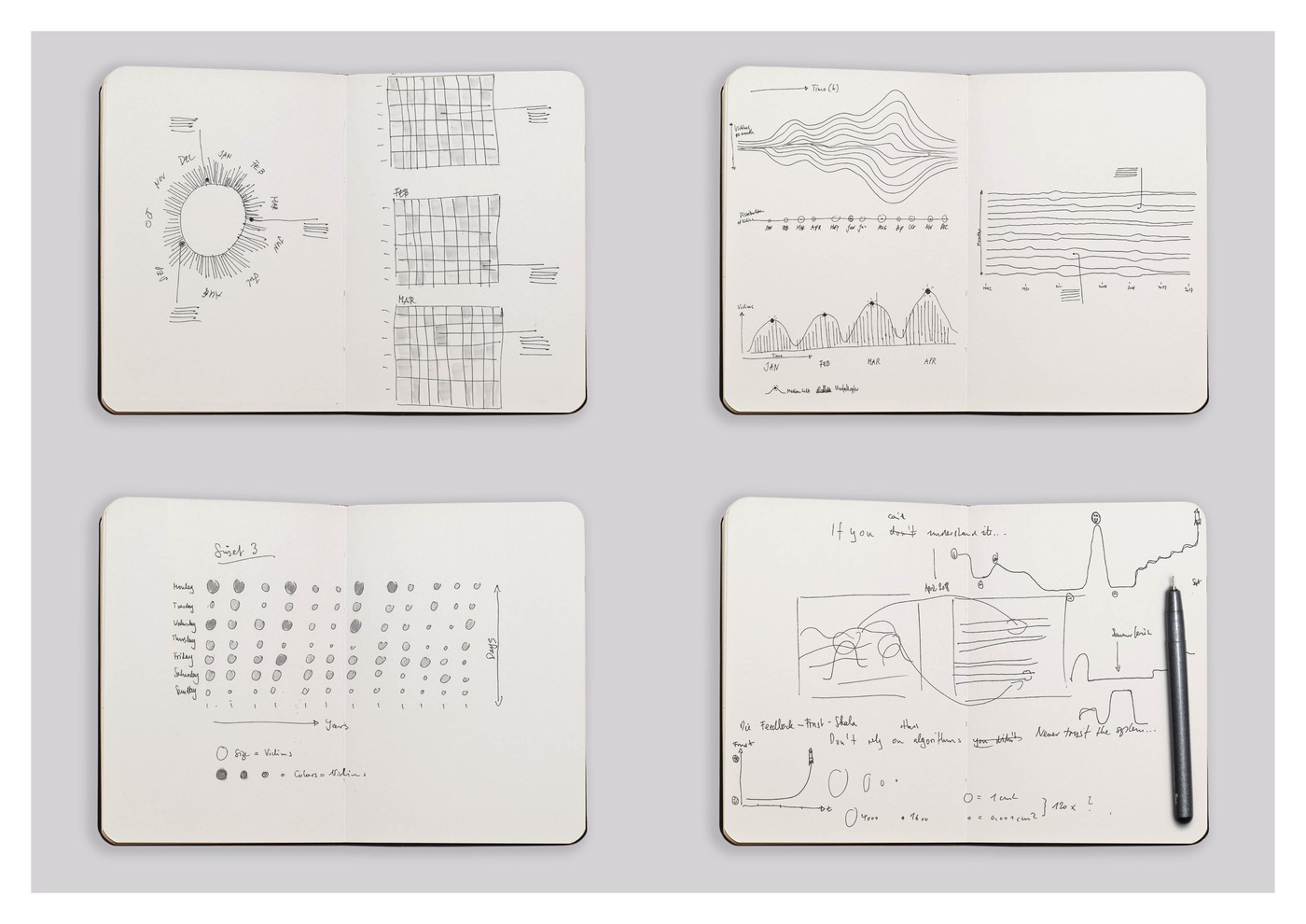
I rejected conventional chart types early. A bar chart of monthly totals is accurate but invisible. It carries the data without creating understanding. I started in a sketchbook, not in software, sketching radial layouts, grid structures, and wave forms.
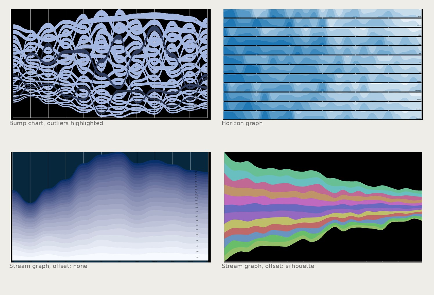
The dataset was too large to model by hand, so before building anything I evaluated the tools available. Tableau read as built for business analysts and felt over-engineered for what I needed; Plotly leaned too far toward developers with Python skills I didn’t have; Datawrapper was fast but its chart types were conventional. I settled on Raw Graphs, an open-source tool aimed squarely at designers, for its unconventional plot types: stream graphs, horizon graphs, dendrograms.
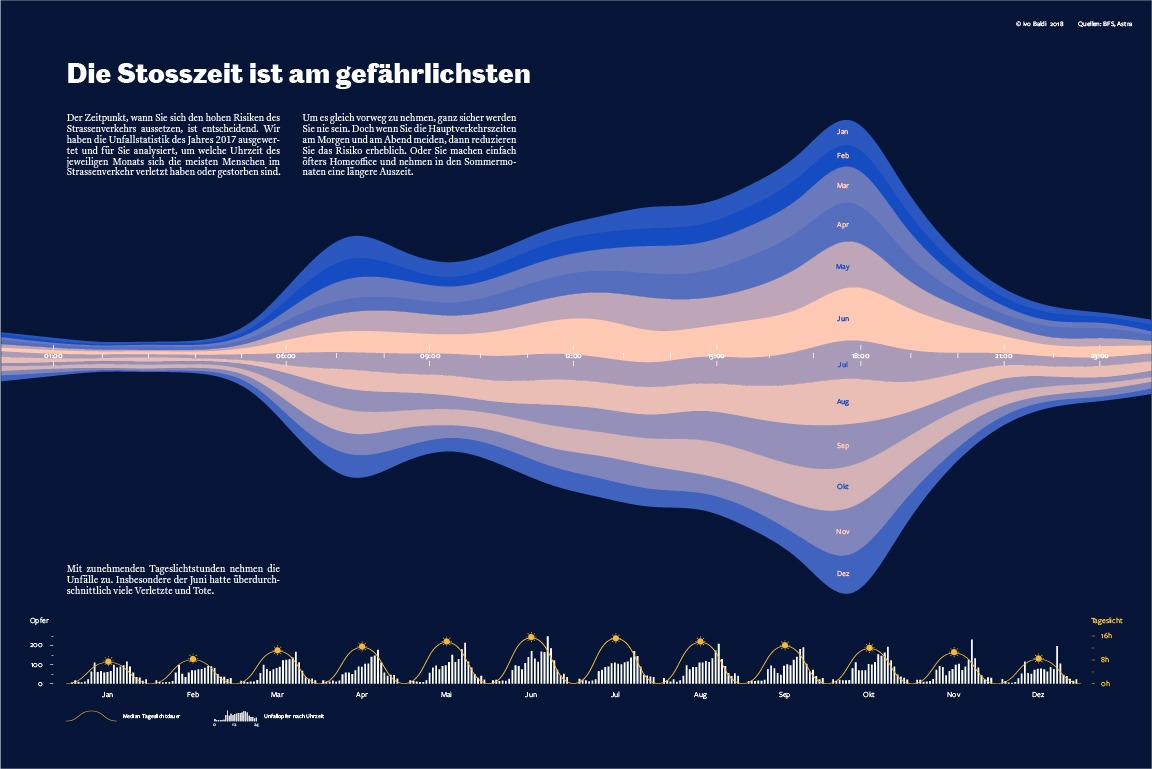
I used it to explore bump charts, horizon graphs, and stream graphs with different offsets before committing to the stream graph, because it communicated the wave-like rise and fall of accident frequency without asking the reader to first understand the underlying data.
The hardest problem in data work is not accuracy. It is encoding the data in a form that makes the insight feel obvious in retrospect.
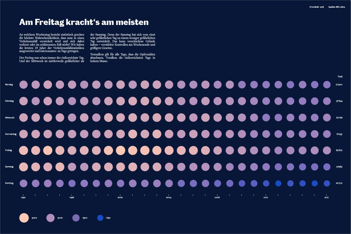
Each visualisation isolated a different dimension of the dataset. A stream graph plotted accident frequency by hour and month together, revealing that accidents cluster around commute windows and shift with the seasons as daylight changes. A dot matrix laid out all 25 years by weekday side by side, making the elevated risk of Fridays, and the declining risk of Saturdays as enforcement tightened, read as a structural pattern rather than a coincidence.
Testing an early version with size-based hierarchy showed the risk of over-designing this: sorting the months by victim count made the chart punchier, but broke the chronological order readers relied on to orient themselves, and slowed comprehension. I kept the timeline intact and let color density carry the emphasis instead.
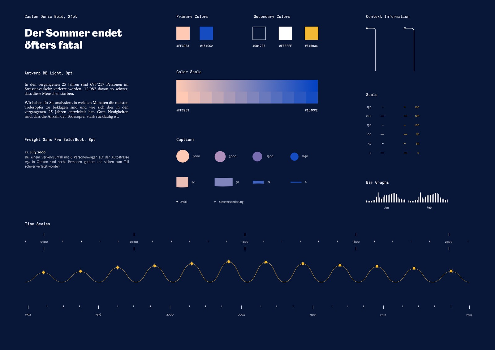
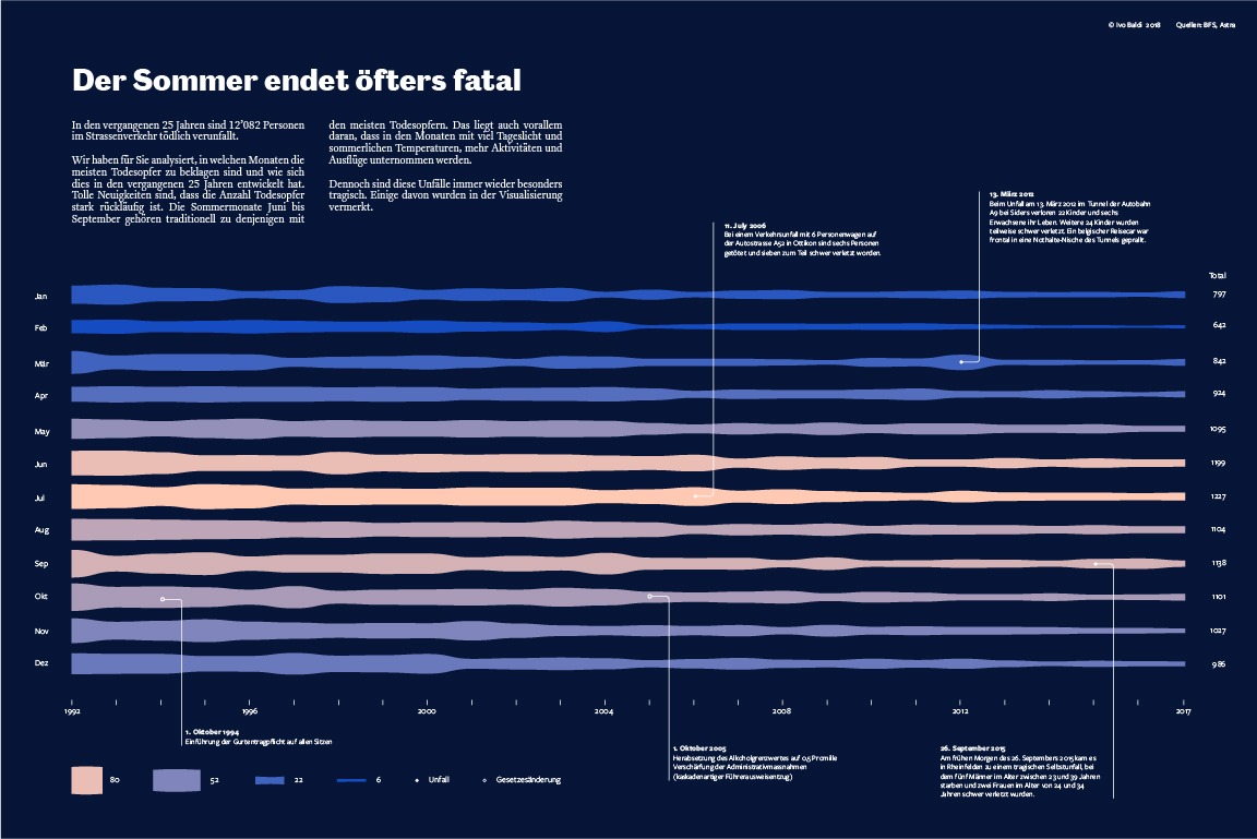
A consistent color and type system tied every piece together across the series, set in the host publication’s own headline and body type, with a separate, tighter-set typeface for scales and captions. Explorative annotations of specific, dated accidents invited readers to connect the statistics back to real events.
Before
Federal accident data too coarse: six-hour blocks, no victim counts
Raw statistical data with no visual language
Multiple entangled dimensions: hour, weekday, month, year, severity
No established visual form for the problem
Target audience needed depth, not a headline figure
After
Hourly, severity-level data secured directly from the federal roads office
Stream graph showing accident frequency by hour and month together
Dot matrix encoding 25 years of weekday totals simultaneously
Daylight overlay surfacing the causal link with commute-time peaks
Shared color and type system across the full visual series
Annotated real accidents giving the statistics human context
The finished series demonstrated that complex statistical data could be made genuinely engaging for a general audience, not by simplifying it, but by finding the right visual form for each dimension of the dataset and giving the reader time to sit with it.
I would test the visualisations with readers outside the design and data community before finalising. The stream graph in particular rewards a moment of explanation before it clicks. I assumed more visual fluency in my target audience than was realistic.