Renewing eGB, the electronic land registry tool used by every notary office in the canton of Zurich
eGB · Notariate Kanton Zürich · Enterprise legal software

eGB, the electronic land registry, is the specialised application that notary offices across the municipalities of the canton of Zurich, and the cantonal land registry offices, use to manage legally binding land register entries: ownership, liens, easements, annotations. I was brought on as lead UX designer to renew the application, covering the UX concept, screen design, and the ongoing collaboration with engineering through implementation.
My role spanned the full arc of the work: building the UX concept and screen designs, consulting directly with the client’s subject-matter experts, and staying involved through implementation rather than handing off a set of screens and moving on.
The users are legal professionals working under strict formal requirements. Every table, label, and interaction had to remove ambiguity, not just look clean. The data carries legal weight, and a misread table cell or an unclear selection state is not a minor usability issue in this context.
The application also spans many distinct case types: ownership changes, liens, easements, deployed across separate environments for different notariats. Any pattern I introduced had to hold up consistently across all of them, not just the specific screens directly in scope.
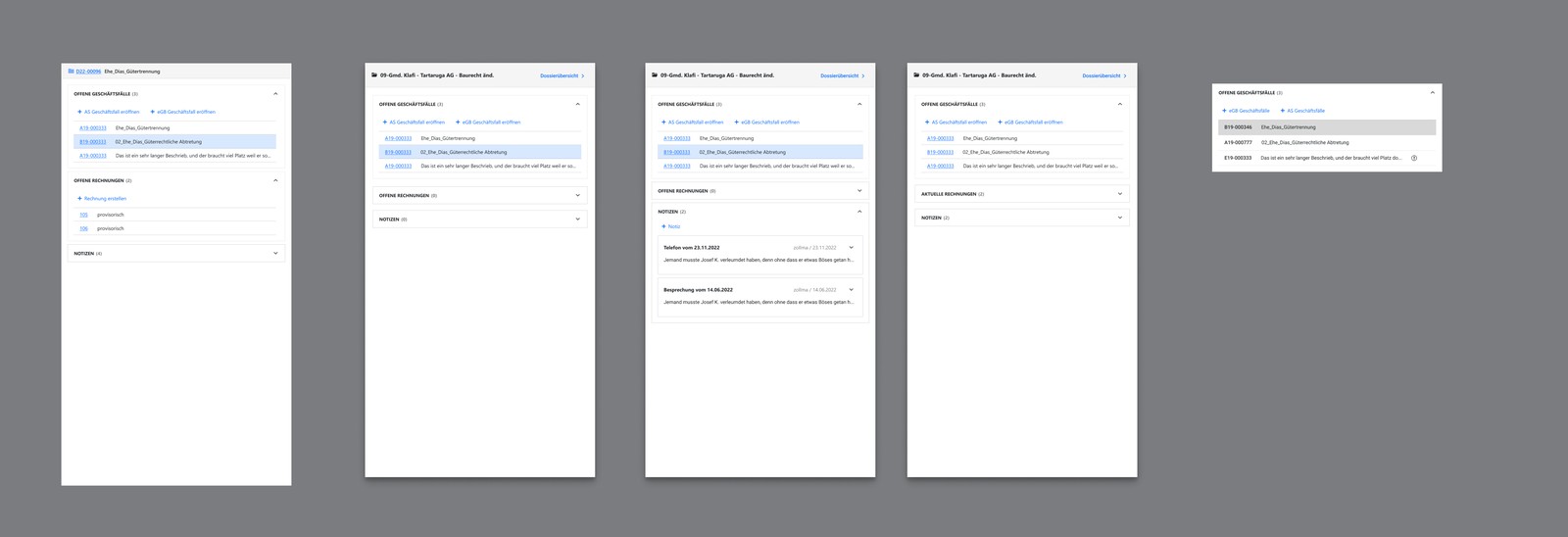
Rather than approaching this as a series of individual screen redesigns, I framed it as building a shared design language for dense, legally precise data: table content rules, interaction patterns, and a button taxonomy that any new screen could inherit rather than reinvent. The dossier/flyout navigation, the panel that orients a user within a case file, went through several rounds of concept iteration before I landed on a version that gave people a reliable sense of where they were.
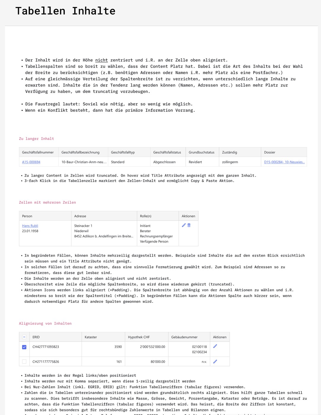
In legal software, ambiguity isn’t a UX flaw. It’s a liability. Every rule in the table system existed to remove one specific kind of doubt.
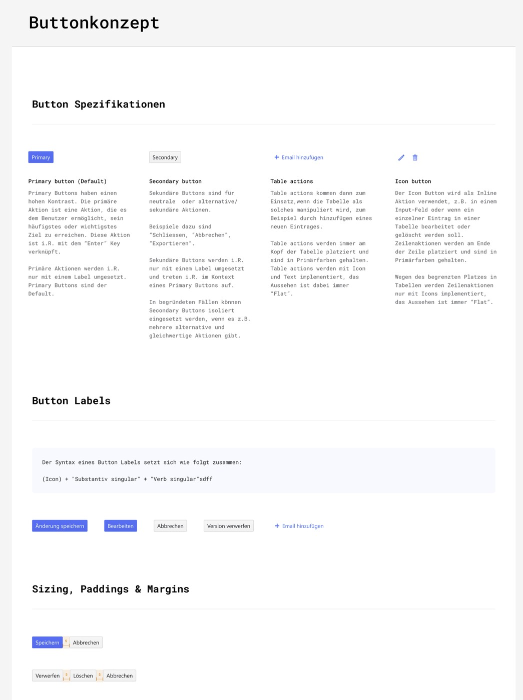
Working closely with engineering and the notariats’ subject-matter experts, I documented concrete, testable rules: how table content aligns and truncates, how multi-line content is handled without breaking the grid, and when an overflow menu replaces a growing list of actions. Alongside it I built a button taxonomy: primary, secondary, table actions, icon buttons, down to the exact syntax for a button label, so two designers working on different screens would still arrive at the same button for the same situation.
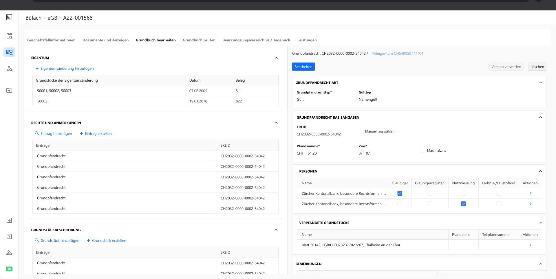
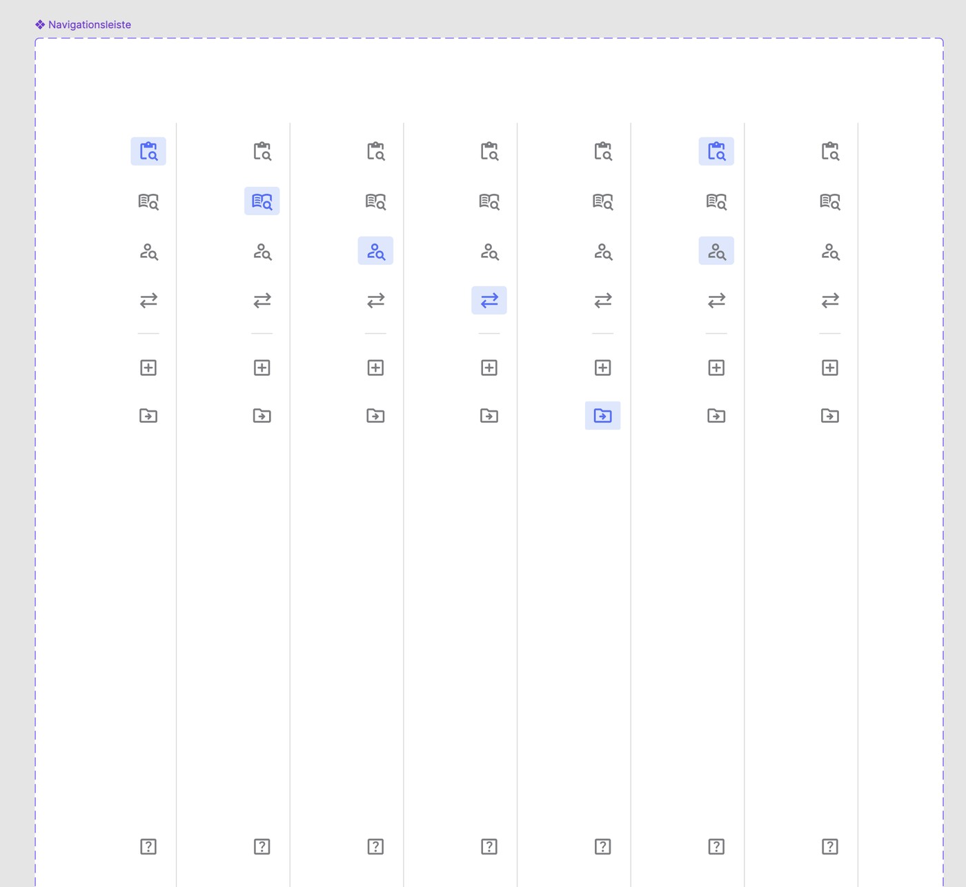
I ran usability testing directly with notariat staff, since eGB is a tool they rely on daily, and synthesised the findings against the application’s actual modules, the shell/flyout, eGB, Leistungen, and Rechnungen, turning specific pain points into prioritised measures rather than leaving them as general impressions.
Before
No documented rules for table content: truncation, alignment, and multi-line handling decided ad hoc per screen
No button hierarchy or naming convention across the application
Dossier/flyout orientation unclear: testers could not tell where a case file’s cases, invoices, and notes lived
Selection and drilldown behaviour inconsistent between tables
Design decisions untested against real notariat staff
After
Documented table content rules, covering alignment, truncation, multi-line, and overflow menu, applied across all modules
Button taxonomy with primary/secondary/table/icon variants and a fixed labeling syntax
Flyout redesigned after iteration, with dossier context always visible
Consistent selection, drilldown, and breadcrumb navigation across tables
Usability findings from real notariat staff fed directly into prioritised measures
The design system now spans the shell, eGB, Leistungen, and Rechnungen modules consistently, used daily across notary offices in the canton of Zurich. Usability testing surfaced specific, addressable issues: unclear selection behaviour, ambiguous dossier orientation in the flyout. Both were converted into concrete design measures rather than staying as general feedback.
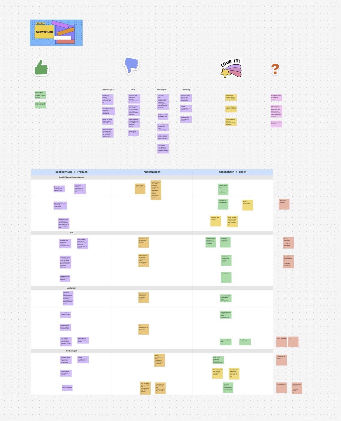
I would set up structured usability testing earlier in the process, module by module, rather than validating late once several modules were already built. The cross-module inconsistencies the testing surfaced would have been cheaper to fix if caught before the pattern had already spread.