How I built the design foundation that let a growing enterprise company ship with coherence
Pyrene Design System · Open System · Enterprise software
Open System was growing. As the business evolved, keeping a coherent, high-quality experience across the interfaces of Mission Control, the company’s network security platform, was becoming harder to sustain. Each new feature arrived with its own interpretation of basic visual decisions, because there was no shared foundation to work from: no documented color system, no agreed component behaviour, no shared design principles.
The system had to be built on React, since Mission Control was a live product under continuous development by engineering, and it had to work in two directions at once. It meant identifying and migrating patterns that already existed piecemeal across the product, and specifying entirely new components that did not exist yet, all without pausing feature delivery.
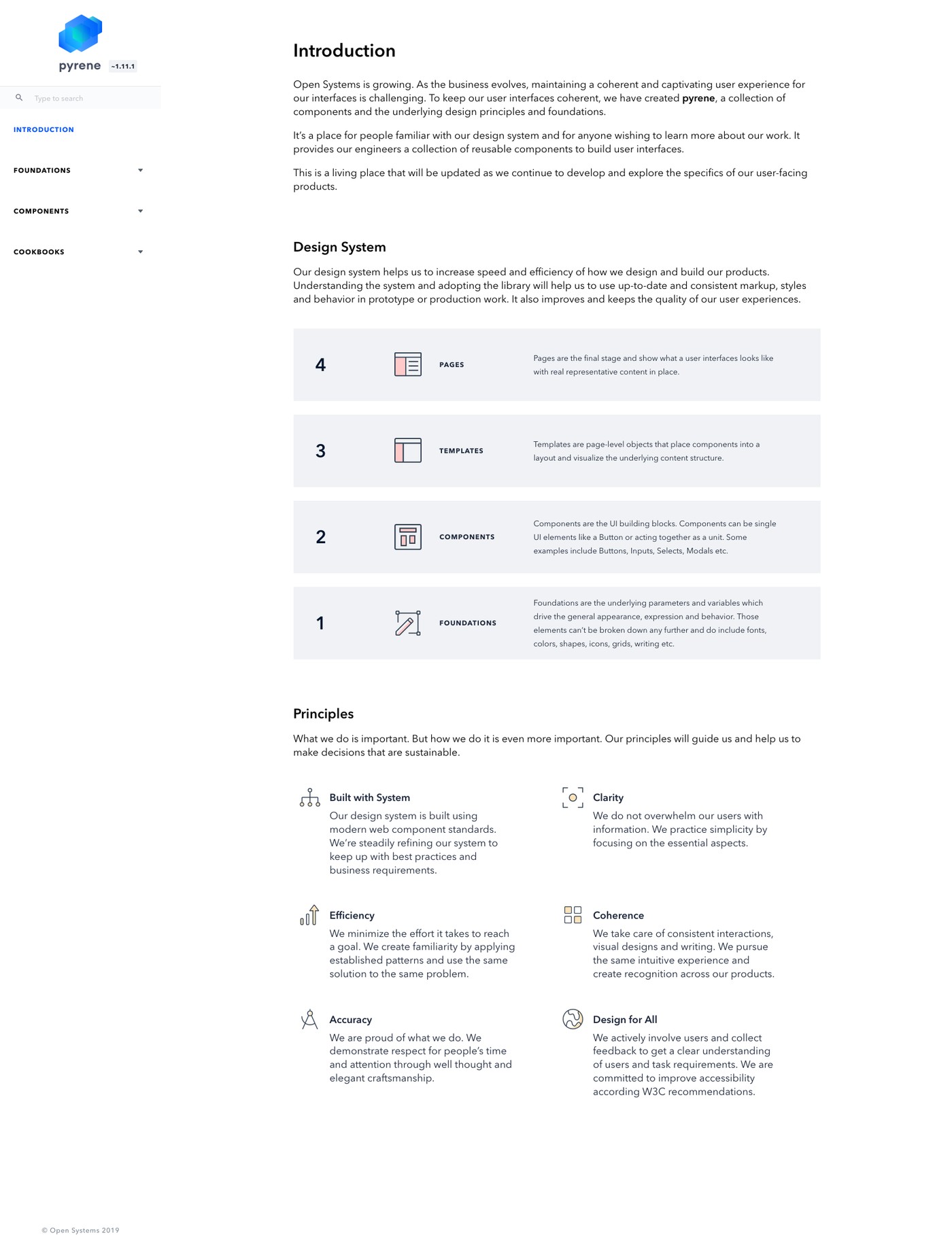
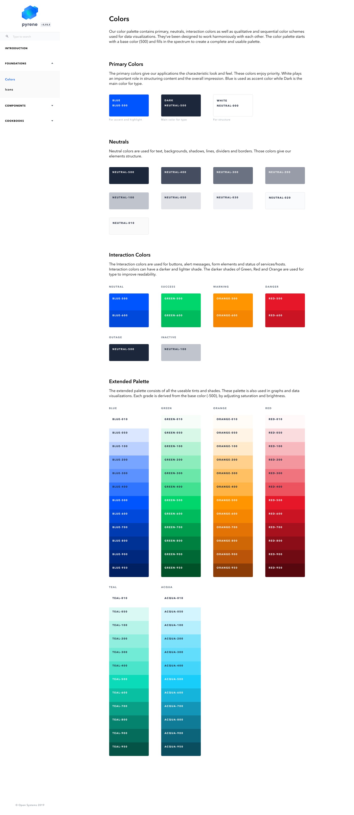
I framed Pyrene not as a component library but as the foundation the whole team could build on. Before designing a single component, I set out the principles the system would hold itself to: built with system, clarity, efficiency, coherence, accuracy, and designed for all. Then came the token layer beneath them, primary and neutral colors, interaction colors for state and feedback, and an extended palette built specifically for data visualisation.
Those foundations were what let every component that came after read as part of one system, rather than a collection of one-off designs that happened to ship together.
A design system isn’t a component library. It’s the shared foundation that lets a growing team stop re-deciding the same visual questions.
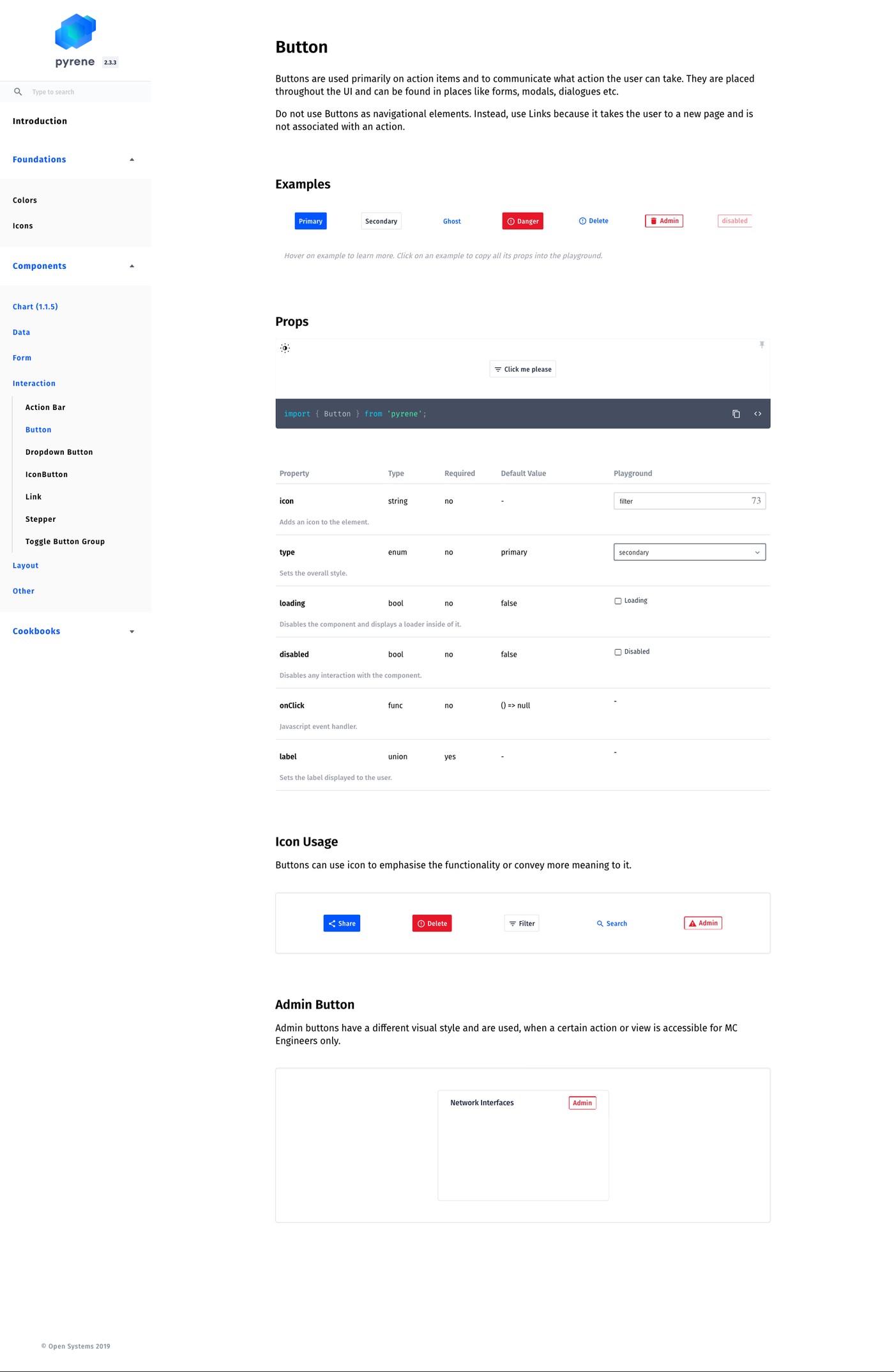
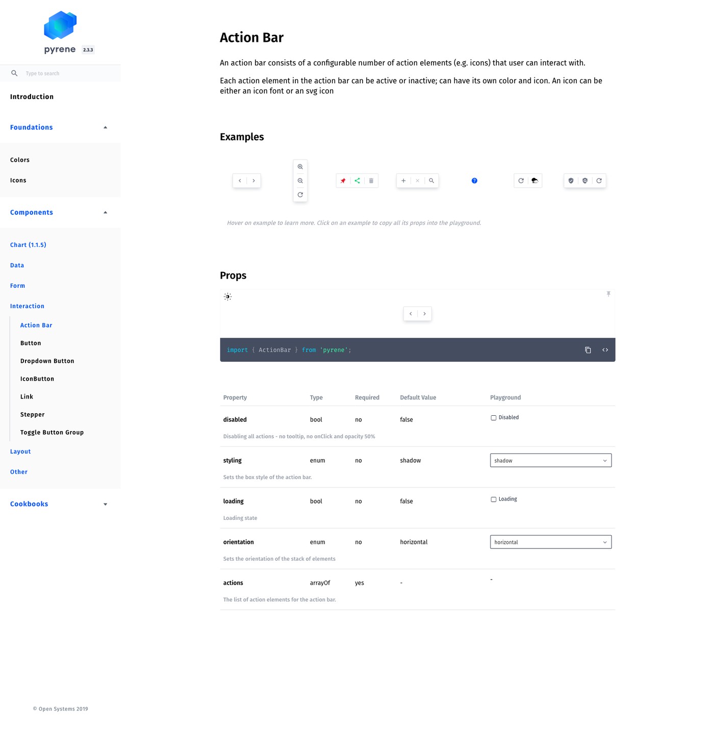
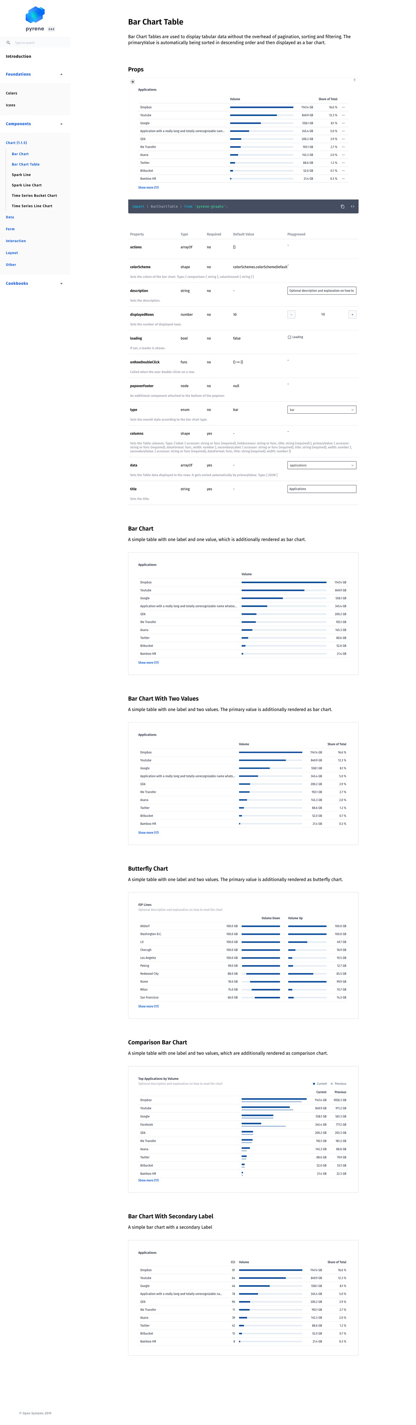
With the foundation in place, I audited the existing product to identify which UI patterns could be migrated into Pyrene as they were, and which needed to be defined from scratch. That meant specifying their props, states, and usage guidance in documentation built for engineers to implement directly against. Components range from simple primitives like Button and Icon to genuinely complex ones like the Bar Chart Table, which renders sortable tabular data as a chart without the overhead of pagination or filtering. I also designed Pyrene’s own identity and logo, giving the system a name and a mark of its own within the product.
Working directly with the engineering team through implementation kept the documented specification and the shipped component honest with each other. That gap opens easily when design and engineering work from separate sources of truth.
Before
No shared color system, spacing scale, or component behaviour across the product
Every new feature re-decided basic visual questions from scratch
Existing UI patterns scattered across the product with no single source of truth
No shared vocabulary between design and engineering for handoff
After
Documented foundation: principles, color system, and an extended palette built for data visualisation
Component library spanning primitives like Button and Icon to complex components like Bar Chart Table
Full usage documentation, covering props, states, and examples, built for engineers to implement directly against
Pyrene’s own visual identity and logo, designed as part of the system
Released as an open source project on GitHub
Pyrene has kept growing past its initial release, with new components added as Mission Control’s needs expand. It was released as an open source project on GitHub, giving the work a life beyond the original team.
I would involve engineering leads earlier in the token architecture decisions. Some naming conventions I chose in Figma created friction when translated into code. A shared naming workshop with the lead engineers in week one would have prevented weeks of rework later.
Pyrene is open source
Explore the full component library and documentation.