Designing the Mission Control experience: dashboards and Atlas
Mission Control · Open System · Enterprise security & network software
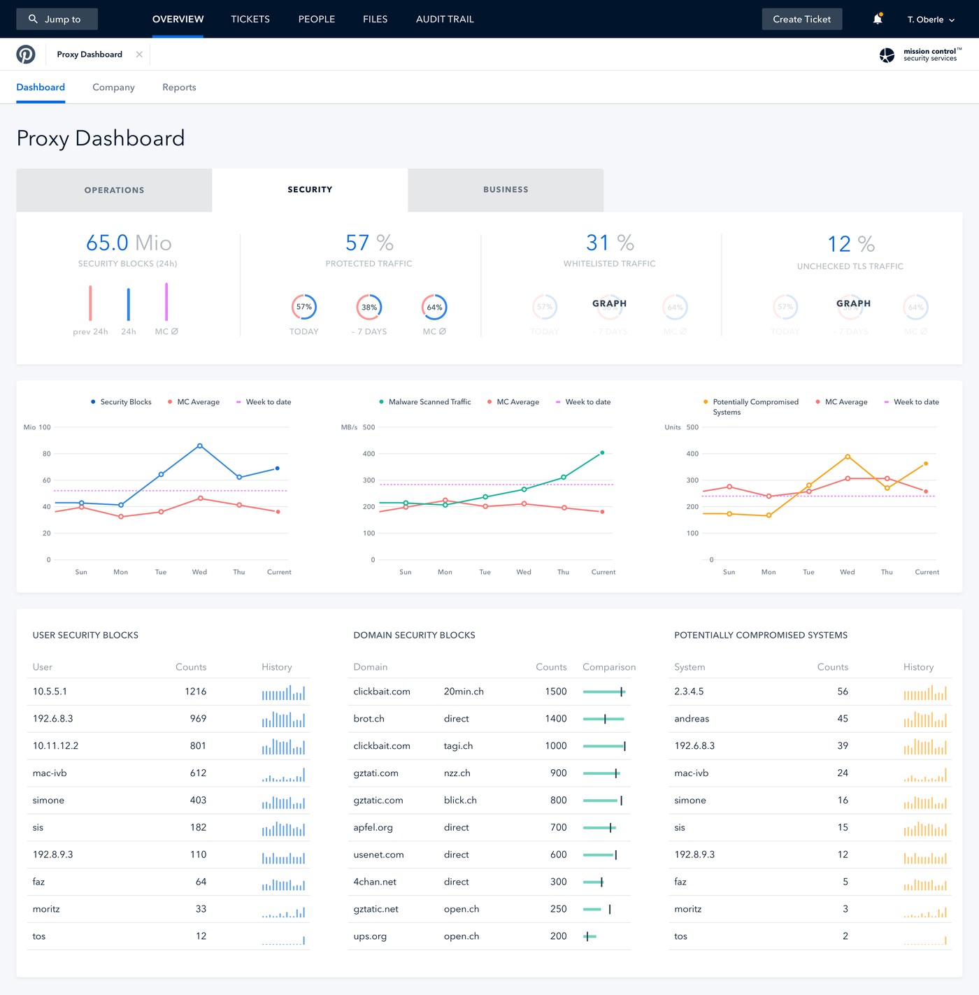
Open System’s Mission Control platform gives customers, mid-size and large enterprises among them, visibility into their own network security and traffic data as part of a managed service. As UX Design Lead, I owned the full customer-facing experience: the dashboard family customers rely on daily, and Atlas, the dedicated tool for exploring global WAN topology and traffic in depth.
Both were the primary way a customer’s own team could see what Mission Control was actually doing for them, so the experience had to work as one coherent product, not a dashboard and a separate analytics tool that happened to share a login.
Two different problems sat underneath this work. On the dashboard side, different roles read the same underlying data differently: operations needed uptime at a glance, security needed threat scores, business needed volume and cost context. On the Atlas side, the data itself was spatial and hierarchical, global map through region, country, city, site, down to one link, and users needed to move fluidly between the big picture and one specific link’s history without losing their place.
Every dashboard and every Atlas interaction state also had to sit inside Mission Control’s existing design system, so the whole experience read as one product family rather than several tools with their own visual logic.
I came to see both problems as versions of the same question: which altitude does this person need to be at right now. For the dashboards, that meant reframing around audience-specific tabs, Operations, Security, Business, on the same underlying data, so each role landed on exactly what mattered to them first.
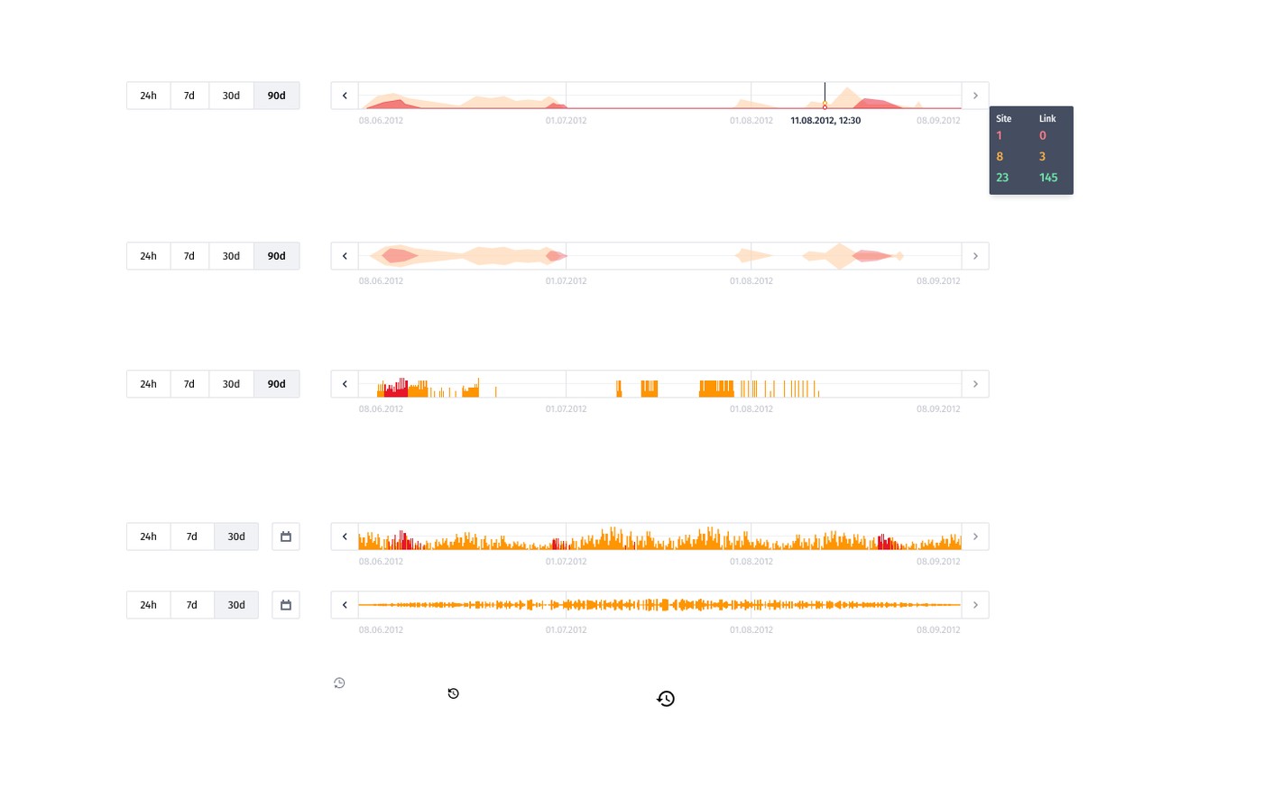
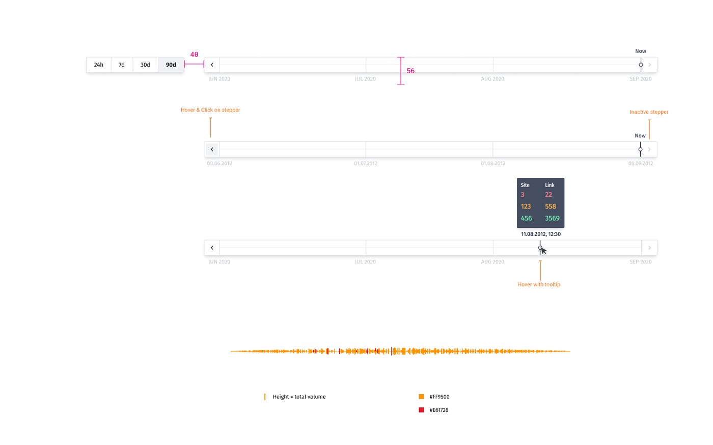
For Atlas, altitude meant something more literal: letting someone drop from a global topology view down to one link’s tunnel-level history, and back out again, without losing orientation. A snapshot view could show that something was wrong right now, but not when it started, so I framed a "time machine" timeline as a first-class second half of Atlas, not an add-on.
The real design problem across Mission Control was never which metric to show. It was which altitude, which audience, which moment, someone actually needed to be at.
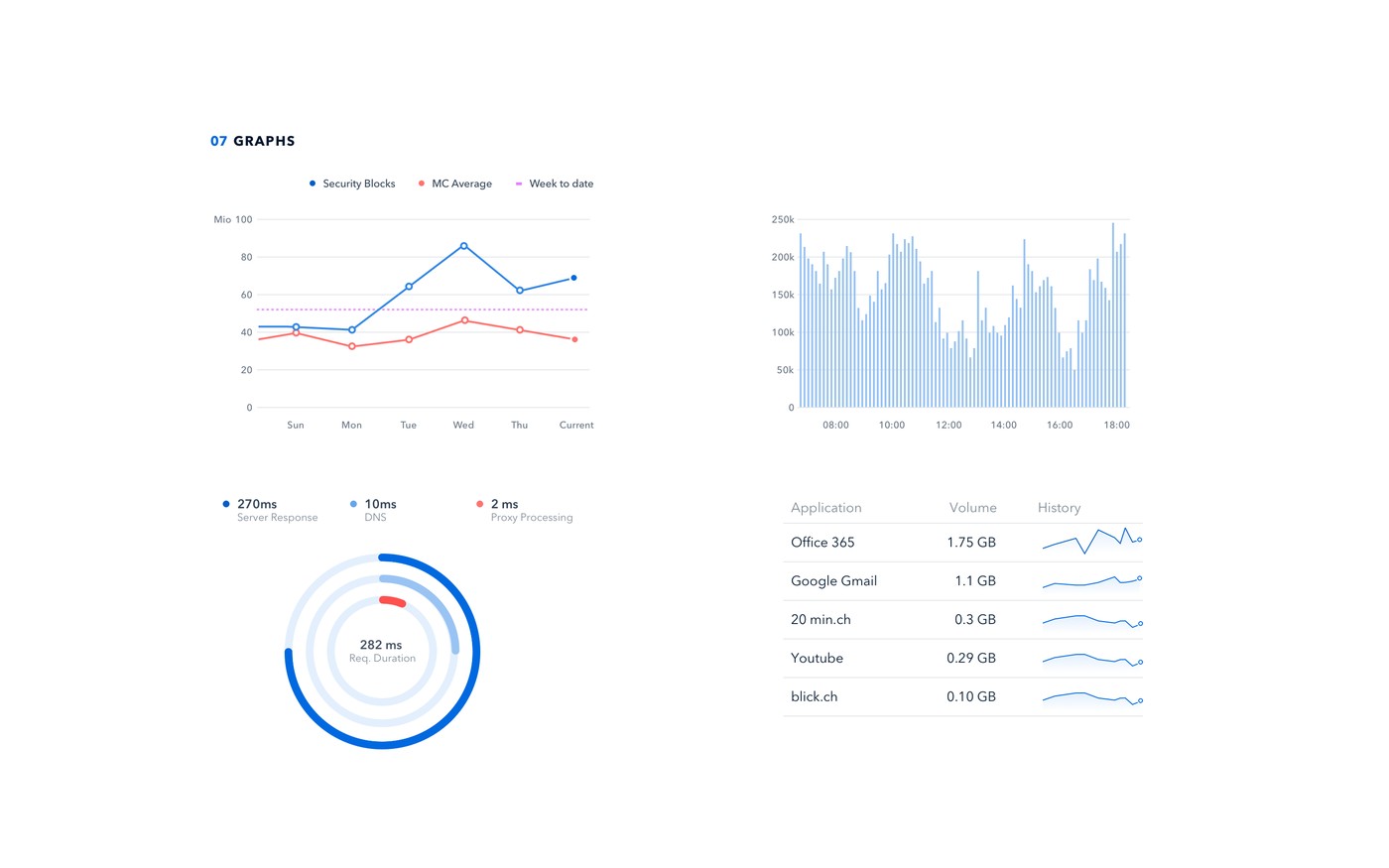
I gathered requirements directly from customers and from the internal engineers closest to what the numbers meant operationally, then translated that into UX concepts, interaction design, and visual design across both the dashboard family and Atlas. For the dashboards, I extended a shared graph and chart component set so every new view, from application traffic volume to security incident investigation, could be assembled from consistent, pre-specified pieces instead of custom visual work each time. Security incident investigation in particular needed its own visual form: a node-and-connection graph that let an analyst trace how an event actually propagated, something a table could never make legible.
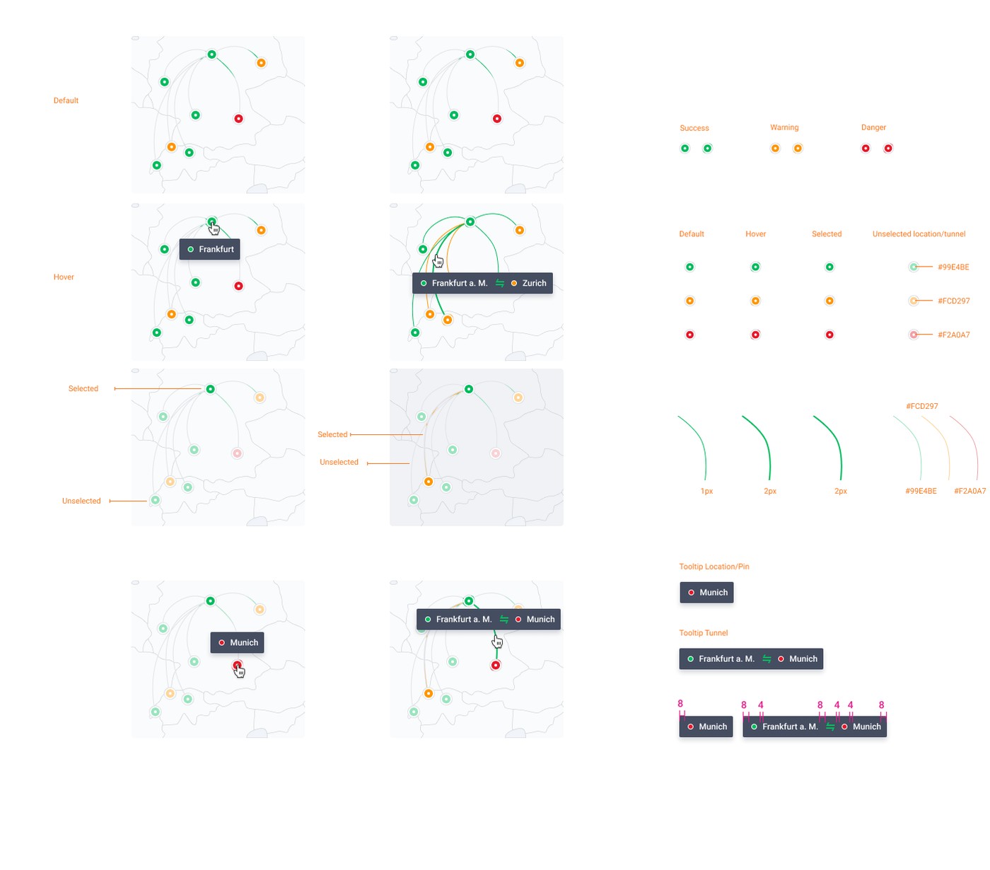
For Atlas, I specified the drill-down hierarchy explicitly, with every level opening the same consistent panel structure, and documented every map interaction state (default, hover, selected) across three severity levels down to exact colors and line weights, so engineering could implement precisely rather than improvising. For the timeline, I explored several ways to encode volume and severity over time, area fills, waveforms, discrete bars, before settling on the version that read clearly both at a glance and when scrubbing to one exact moment. I tested flows with internal engineers before anything reached a customer, and stayed involved with engineering through implementation on both.

Before
One generic dashboard tried to serve operations, security, and business stakeholders at once
No consistent interaction specification for Atlas map states across severity levels
Drill-down levels in Atlas built ad hoc, with inconsistent panel structure
Only a current snapshot of network state, no way to see how it got there
Chart and map components built one-off per screen rather than shared
After
Audience-specific dashboard tabs (Operations/Security/Business) surfacing only what matters to each role
Documented Atlas interaction states (default/hover/selected × success/warning/danger) with exact measurements
One consistent drill-down hierarchy and panel structure from the global map to a single tunnel
"Time machine" timeline letting users scrub through network history, not just see the current state
A shared component system, charts and map states alike, reused across the whole Mission Control experience
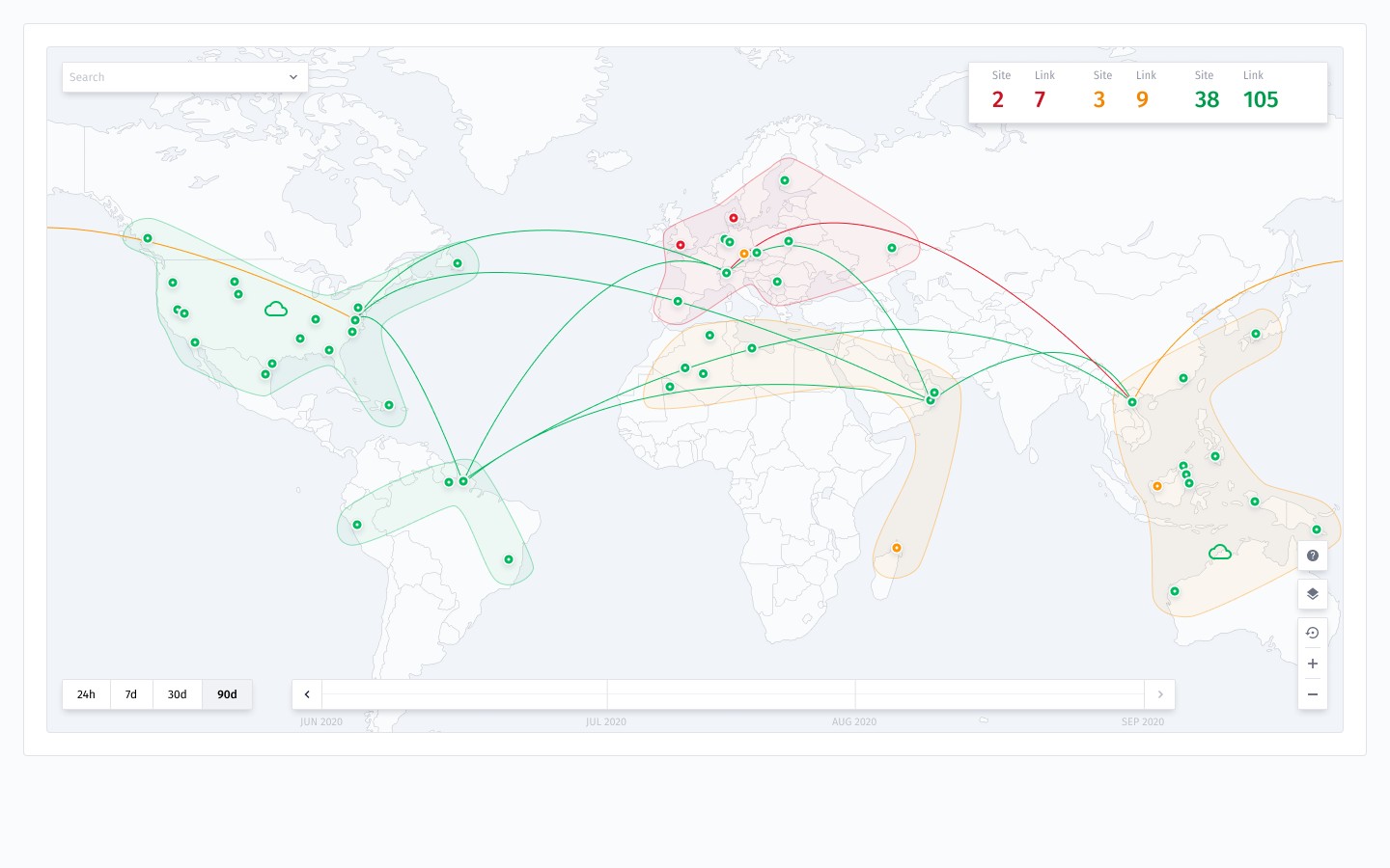
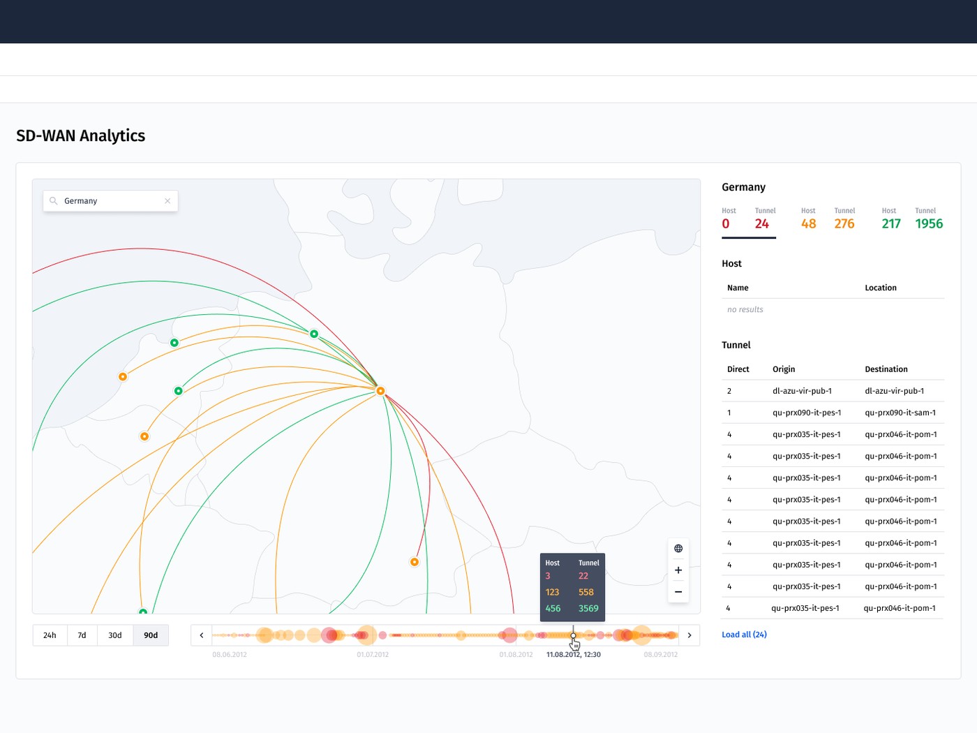
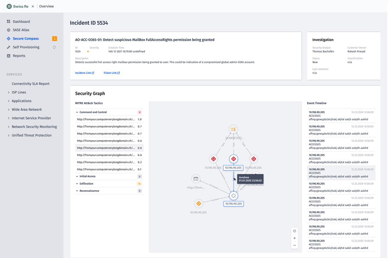
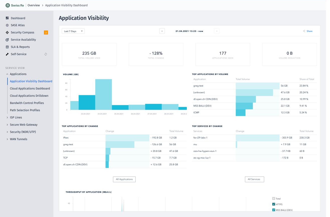
Dashboards and Atlas shipped as one coherent experience: the primary way customers see, and act on, their own Mission Control data day to day. An operations engineer, a security lead, and a business stakeholder can each land on the view built for their role, and any of them can drop from a global view straight down to one link’s history when something needs a closer look.
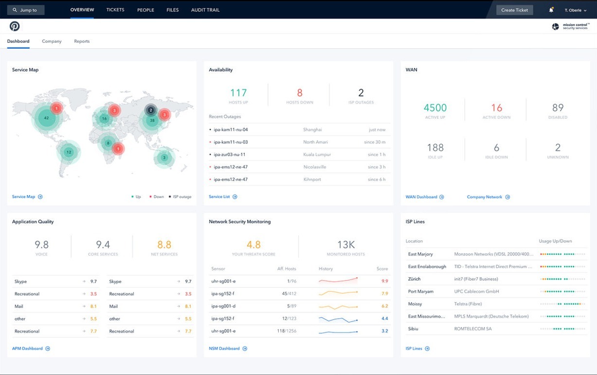
I would push for earlier alignment on the timeline’s visual encoding, and bring customer stakeholders into requirements conversations more consistently on both sides of this work. Some assumptions validated internally with engineers needed adjustment once real customers used the product, catching that earlier would have saved rework on both the dashboards and Atlas.