Redesigning a shift trading tool that 100+ engineers depended on around the clock
Shift Plan · Open System Mission Control · Internal enterprise tool
Engineers at Open System run Mission Control, the company’s network security platform, around the clock. Each engineer is scheduled across a defined set of shift types: morning, afternoon, weekend, holiday. Every month’s plan is published so the team can see their shifts and trade them directly with each other. The existing tool had accumulated logical bugs, but the deeper problem was an experience that gave engineers no confidence in what they were actually agreeing to.
The users were engineers: precise, technical, and unwilling to tolerate an interface that behaved inconsistently. For a team running 24/7 operations, there was no room for ambiguity. The tool needed to be exactly right, not roughly right.
The brief was to fix a webapp with poor UX. Structured interviews with a cross-section of engineers reframed the problem: trading a shift and looking up your next shift were the two use cases that mattered, and the confusion engineers felt wasn’t about the interface. It was that the trading model itself never made clear which shift they were giving up and which they were receiving. That’s a clarity-of-state problem, not a visual one.
Engineers weren’t confused by the design. They were confused by what the design was asking them to commit to, a different problem, and a harder one to solve.
I ran structured interviews with engineers across the team to map their actual pain points and priorities. The redesign made every trade explicit: both sides of an exchange stay visible together at every step, through to confirmation. Accepting a trade means seeing exactly what you’re giving up and what you’re getting. I also defined a new identity for the tool within Mission Control, giving the redesign its own name and logo, Shift Plan, separate from the legacy system it replaced.
Before
Trading flow required engineers to track prior selections without confirmation
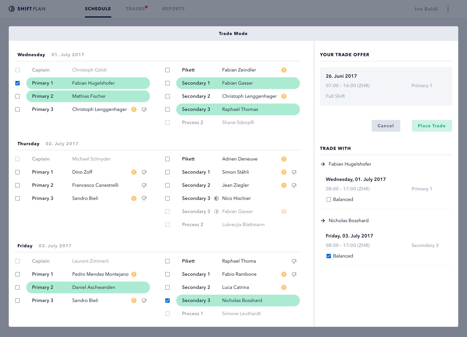
Confirmation screen didn’t surface the full exchange
No dominant use case, every feature carried equal weight
Logical bugs compounded the UX confusion
No validated prototype before build
After
Every trade shows both shifts and both parties before confirmation
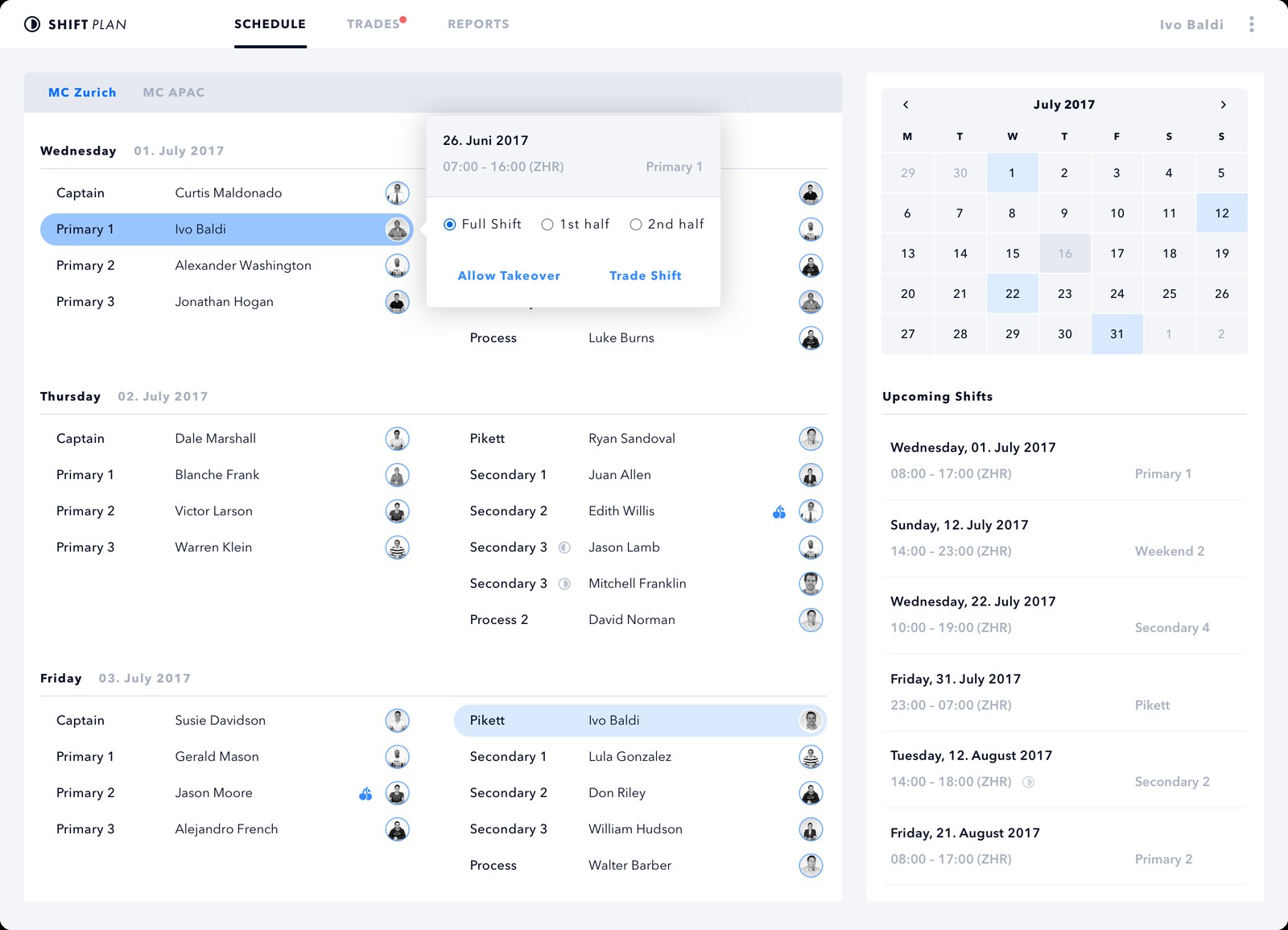
"Your next shift" as the primary, first-load state
Two dominant use cases, lookup and trade, drive the IA
Prototype validated directly with engineers before handoff
New name and identity, Shift Plan, established within Mission Control
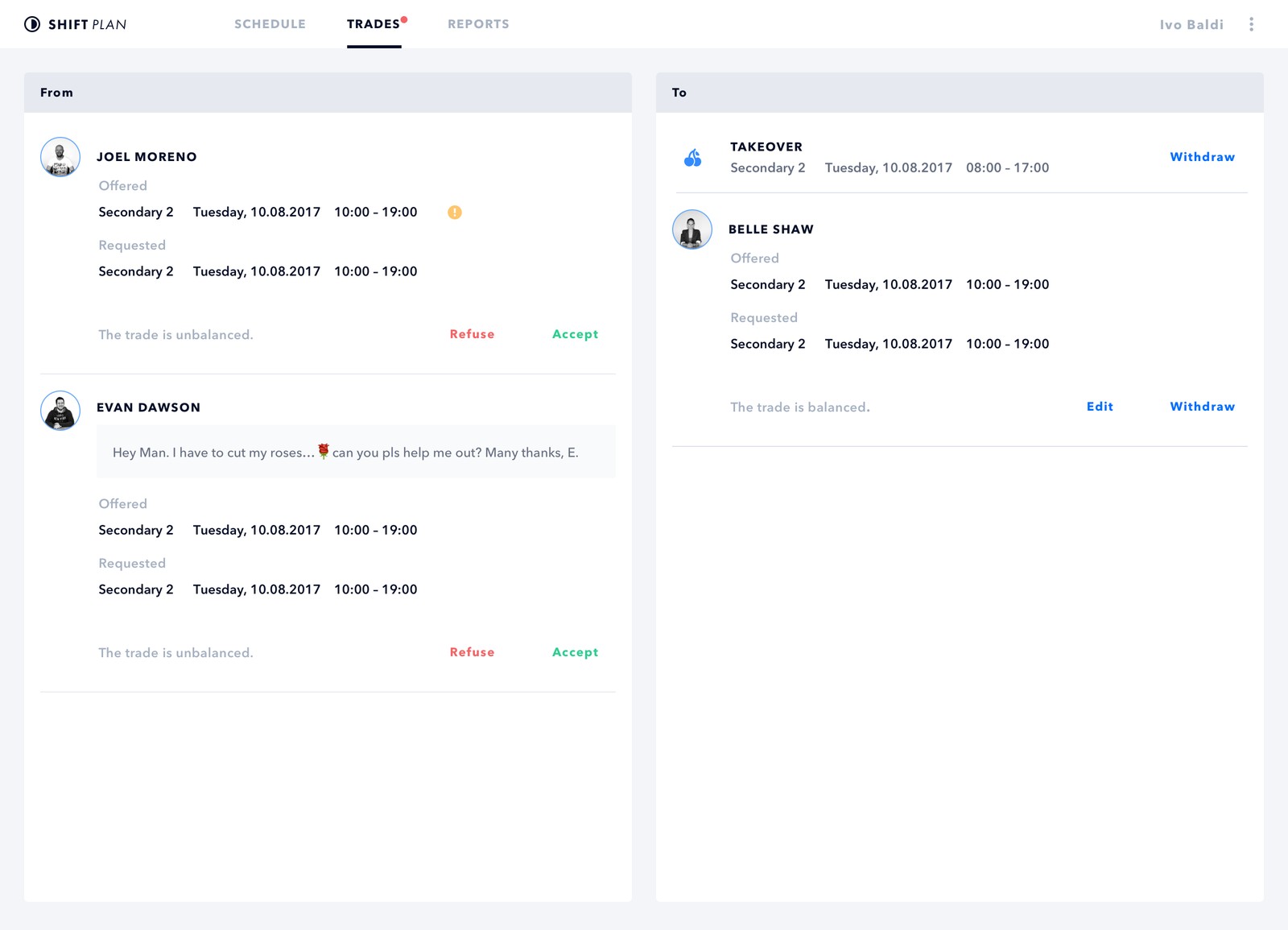
Early feedback from the same engineers interviewed during research was positive. They called out the clarity of the confirmation screen directly as solving the specific problem they’d described. Admin views and shift-balance reporting are the next scope.
I’d run a short diary study before the interviews, asking engineers to log moments of uncertainty over two weeks. For a tool this operationally critical, that additional layer of research would have sharpened the redesign before it reached prototype.